
Kerning and letter spacing: A beginner's guide to making your font readable
Spacing problems are one of the most common things that make an otherwise well-drawn font look amateurish, and the fix has a specific name and a specific, learnable process.
Three related but different terms
Letter spacing (or tracking) is a single, uniform adjustment applied evenly across a whole word or block of text, making everything slightly tighter or looser at once.
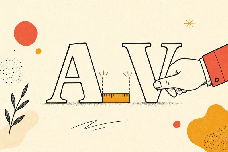
Kerning is much more targeted: adjusting the space between one specific pair of letters, like “AV” or “To,” where the natural shapes of those two characters leave more or less visual gap than the rest of the alphabet.
Spacing in the broader sense refers to the base amount of white space built into each individual character before any kerning pairs are applied on top of it.
Why some pairs need special treatment
Most letters have fairly straight, predictable sides, so a consistent overall spacing value works fine between them. A handful of letter combinations don’t play by that rule. A capital “A” next to a capital “V” naturally leaves extra visual gap between their diagonal strokes. A capital “T” followed by a lowercase “o” or “a” often looks too tight, since the T’s crossbar overhangs the letter beside it. Kerning exists specifically to correct these individual exceptions without changing the spacing everywhere else.
Where to start as a beginner
Don’t try to kern every possible letter combination on your first font. Focus on the handful of pairs that are actually visually obvious once you set real words: capital letter combinations first, since they tend to show the biggest gaps, then a few common capital-to-lowercase pairs. Getting these few pairs right fixes the majority of what a reader will actually notice.
Using automatic tools as a starting point, not a finish line
Most font-making tools, from beginner-friendly options through to professional editors, offer some form of automatic spacing or kerning suggestion. These are a genuinely useful starting point, especially for a first font, but they’re not a substitute for checking real words afterward. Set your actual name, or a sentence you plan to use the font for, and look for any pair that still reads as too tight or too loose, adjusting by eye from there.
When to actually tackle this
Kerning is a refinement step, not a requirement to ship a working font. Get your letterforms consistent and your overall spacing reasonably even first; that’s covered in our hand-lettering guide and from sketch to font file piece. Once you have a font you’re already happy with in general use, kerning specific problem pairs is the natural next polish step, not something to front-load before you’ve even finished drawing the alphabet.
Frequently asked questions
What is kerning in typography?
Kerning is the fine adjustment of space between two specific letters, like 'AV' or 'To', so that particular pair looks evenly spaced rather than gappy or cramped, unlike overall spacing which applies the same value everywhere.
What's the difference between kerning and tracking?
Kerning adjusts space between individual letter pairs. Tracking (sometimes called letter spacing) adjusts the overall space uniformly across a whole word or block of text, rather than targeting specific problem pairs.
Why do some letter pairs need kerning and others don't?
Letter pairs with diagonal or open shapes, like A and V, or a capital T followed by a lowercase o, tend to leave more visual white space between them than pairs of straight-sided letters, which is exactly what kerning corrects.
Should a beginner worry about kerning on their first font?
Not immediately. Get consistent letterforms and reasonably even overall spacing working first. Kerning specific problem pairs is a refinement worth tackling once you already have a font you're happy with in general use.
How many letter pairs typically need kerning?
A full professional font can have hundreds of kerning pairs adjusted, but a small, genuinely useful set, capital letters next to each other and against lowercase, usually covers the most visually obvious problems for a beginner project.
Can software calculate kerning automatically?
Many font tools offer automatic spacing and kerning suggestions as a starting point, which is a reasonable base for a first font, though a trained eye checking real words afterward will still catch problems an algorithm misses.
What happens if I skip kerning entirely?
Your font will still function and display text correctly. Certain letter combinations may just look slightly uneven, with some pairs reading as a bit too close or too far apart. It's a polish step, not a functional requirement.