
How to design a font: A beginner's roadmap to your own typeface
How to design a font sounds like a question only professional type foundries can answer, and the polished end of that craft does belong to them. But how to make your own font, a genuinely usable one built from your own handwriting or your own drawn letterforms, is well within reach for a total beginner. It just takes the steps in the right order: paper before software, consistency before flourish. Here's the roadmap.
How to design a font: the beginner's overview
Before the steps, the shape of the whole job. How to make your own font breaks down into five stages: draw one letter until it stops drifting, fix the proportions those letters will share, draw the rest of the character set against them, convert the drawings into a real font file, then space it. Only the fourth stage needs software. Most people asking how to create a typeface expect the opposite, and that assumption is why so many first attempts collapse in the font editor rather than on paper.
Step 1: draw the same letter, over and over, on paper
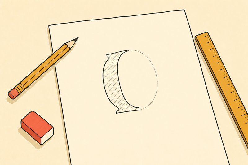
Every stable typeface starts as a repeatable hand shape, not a digital curve. Before you touch any software, pick one letter, ideally a lowercase "o" or "n" (they reveal a lot about your natural proportions), and draw it a dozen times on ruled guides until the height, width and weight stop drifting between attempts. This is slower than it sounds, and it's the single most important step in the whole process: a font where every letter shares the same DNA reads as a deliberate design, while one where each letter looks hand-picked from a different alphabet reads as a mistake.
Our own Practice Sheet Generator builds exactly this kind of guided paper: pick a baseline, grid or dot-grid style, choose an x-height ratio, and print as many sheets as you need.
Step 2: decide your proportions before you draw the rest of the alphabet
Two numbers decide most of a typeface's personality: x-height (how tall lowercase letters stand relative to capitals) and the ratio between your thickest and thinnest strokes. A tall x-height with even stroke weight reads as modern and highly legible at small sizes. A shorter x-height with more contrast between thick and thin reads as classic and literary. Pick a direction before you draw letter two, because changing it halfway through means redrawing everything that came before.
Step 3: draw the full character set
A minimal usable font needs roughly 75 to 85 characters: the 26 lowercase letters, 26 uppercase letters, numerals, and basic punctuation. Work through them in related groups rather than alphabetical order. Letters built from similar shapes (o, c, e, or n, m, h, u) will go faster and stay more consistent if you draw them next to each other, since you can check each new letter directly against its closest relative.
Step 4: turn your own drawings into a real font file
This is where dedicated tools take over. For hand-drawn or handwritten letters, Calligraphr is built for exactly this step: print its template, fill in each character by hand, scan or photograph the page, and it converts your drawings into a working .ttf or .otf font file automatically, with no font-editing software required. If your style is more geometric or blocky, FontStruct offers a free, browser-based alternative that builds letters from a fixed set of interlocking "bricks," similar to digital Lego, though it's less suited to flowing scripts since everything is constructed from straight edges and simple curves. For anyone ready to go further, professional tools like Glyphs or the free, open-source FontForge give full control over spacing, kerning and multiple weights, at the cost of a real learning curve.
A rough, characterful font made by your own hand is a legitimate result, not a failed attempt at the professional version.
Step 5: fix the spacing (and don't worry about kerning yet)
A font's first pass almost always looks a little uneven once real words are set in it, some gaps too wide, others too tight. That's normal, and it's the job of spacing and kerning to fix. As a beginner, get the overall spacing between every letter roughly consistent first. Kerning, the fine-tuned adjustment of specific letter pairs like "AV" or "To," is worth learning once you have a font you're already happy with in general use, not before.
What to expect realistically
A simple handwritten font built through Calligraphr can genuinely be finished in an afternoon. A fully professional typeface, with multiple weights, full kerning, and international character support, is a much longer undertaking, often stretching across months of refinement. Neither outcome is wrong. A rough, characterful font made from your own hand for a personal project or a single brand is a completely legitimate result, not a failed attempt at the professional version.
Once you have letterforms you're happy with, it's worth testing them against established type the way a type designer would: our Type Tester lets you set your own text alongside nine real typefaces spanning every classification, which is a fast way to see whether your new font's weight and spacing hold up next to work that's already been refined for years.
The short answer to how to design a font, then, is that the hard part is not the software. Anyone working out how to make your own font for the first time tends to over-invest in tools and under-invest in repetition, and the people who ask how to create a typeface and then go and fill three pages with the same six letters are the ones who finish. How to design a font is really a question about patience.
Frequently asked questions
How do I design my own font as a complete beginner?
Start on paper, not in software. Sketch the same letter repeatedly on ruled guides until its proportions hold steady, then move on to the rest of the alphabet. Once your letters are consistent, scan or photograph them and bring them into a tool built for turning handwriting into a font, such as Calligraphr.
What software do people use to make fonts?
Calligraphr converts handwritten or drawn letters (from a printed template) into a working font file with no design software experience required. FontStruct is a free, browser-based tool for building fonts from geometric "bricks," which suits geometric or pixel-style type rather than flowing scripts. Glyphs and FontForge are professional-grade font editors for anyone who wants full control over spacing, kerning and multiple weights.
Do I need to know how to draw to design a font?
You need consistency more than raw drawing skill. A simple, slightly rough letterform repeated evenly across a whole alphabet reads as an intentional style. A skilfully drawn letter that doesn't match its neighbours reads as a mistake.
How long does it take to make a font?
A simple handwritten font built with a tool like Calligraphr can be finished in an afternoon. A fully spaced, kerned, multi-weight professional typeface is a much longer project, often months, because of the sheer number of letter combinations that need individual attention.
What is kerning and do I need to worry about it as a beginner?
Kerning is the fine adjustment of space between specific pairs of letters (like “AV” or “To”) so a whole word looks evenly spaced rather than gappy in some spots and cramped in others. It matters more as your font matures; for a first attempt, focus on getting consistent letterforms before worrying about kerning pairs.
What is x-height and why does it matter when I sketch letters?
X-height is how tall your lowercase letters stand, measured against the height of a capital letter. A taller x-height reads as modern and screen-friendly; a shorter one reads as classic and print-native. Deciding on a ratio before you start sketching keeps every letter consistent with the others.
Can I turn my handwriting into a real font?
Yes. That's exactly what tools like Calligraphr are built for: you write out a set of characters on a printed template, scan or photograph the page, and the tool converts each character into a usable font file automatically.
What is FontStruct good for?
FontStruct is a free, browser-based tool that builds letters from a fixed set of geometric “bricks,” similar to digital Lego for type. It's well suited to blocky, geometric or pixel-style alphabets, and less suited to flowing scripts, since everything is built from straight edges and simple curves.
What's the difference between a typeface and a font file?
A typeface is the overall design (the shapes, the personality); a font file is the actual computer file, usually .ttf or .otf, that a program reads to render that design at a given weight and style. When people say "download this font," they generally mean the file, not the design in the abstract.
Do I need to license my font before using it commercially?
If you draw every letter yourself from scratch, you own it outright and can license it however you like. If you build on or modify an existing typeface, check that typeface's own licence first, since many restrict derivative works.
How many letters do I need to draw to make a usable font?
A minimal English font needs the 26 lowercase and 26 uppercase letters plus numerals and basic punctuation, which is roughly 75 to 85 characters. Most beginner-friendly tools, including Calligraphr, offer a ready-made "minimal" character set as a starting template.
Is hand-lettering the same thing as font design?
They're related but distinct. Hand-lettering is drawing a single word or phrase as one-off custom artwork, redrawn fresh each time. Font design means building a full, reusable set of characters that work in any combination, not just the one phrase you originally drew.