
Font types: The complete list of every different font style (with examples)
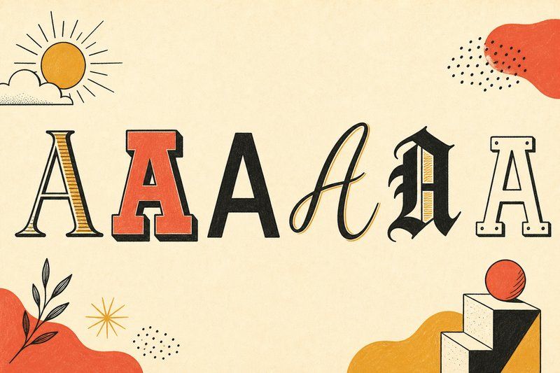
Open a font menu in any design tool and you'll find hundreds, sometimes thousands, of options. Almost all of them fall into a small number of types of fonts, and once you can recognise those families at a glance, choosing (or just talking about) a font gets a lot easier. This guide walks through every major font type, with real examples of each, so you can look at an unfamiliar typeface and immediately place it.
The full list of font types, with examples
There are six families worth knowing by name, and the whole list of font types below is organised around them: serif, sans-serif, slab serif, script, blackletter and monospace. Each section gives you the defining trait, the different font styles that sit inside that family, and a live specimen set in a real typeface rather than a description you have to picture. Read it in order once and the list stops being a list: you start recognising the families in the wild, which is the actual skill.
Serif fonts
Serif fonts carry small strokes, called serifs, at the ends of their letters. The word's exact origin is uncertain, likely from an old Dutch or French term for a stroke or line, and the shape itself is generally traced back to Roman inscriptions, where letters were first painted onto the stone with a flat brush before being carved. The brush's natural flare at the start and end of each stroke is what the carved serif is thought to be reproducing. When printing arrived over a thousand years later, early typefaces carried that same detail straight into metal type.
Serif is not one single look. Type historians generally split it into four sub-groups, and each one signals a different era and mood.
Old-style serifs
Old-style serifs (Garamond, Caslon, Bembo) have a diagonal stress, meaning the thinnest part of a curved stroke sits at an angle rather than straight up and down, and fairly gentle contrast between thick and thin strokes. They read as warm, literary, and comfortable over long passages, which is exactly why they still anchor most book typesetting.
Transitional serifs
Transitional serifs (Times New Roman, Baskerville) sit between old-style and modern. Stroke contrast is sharper, the stress is closer to vertical, and the whole letterform feels a touch more precise. Times New Roman was commissioned by The Times newspaper in 1931 and made its debut in the paper the following year, and remains one of the most recognised typefaces in the world for exactly that reason.
Modern (Didone) serifs
Didone serifs (Bodoni, Playfair Display) push contrast to its extreme: hairline-thin serifs against very heavy main strokes, with an almost perfectly vertical stress. The effect is dramatic and a little severe, which is why Didones show up so often in fashion branding and magazine mastheads rather than body copy.
Slab serifs
Slab serifs (Rockwell, Clarendon) flatten that contrast out entirely. Their serifs are thick, square, and close to the same weight as the main strokes, giving them a sturdy, confident presence that reads well even at small sizes. That toughness is exactly why they became a staple of 19th-century advertising and still dominate headline type today.
Sans-serif fonts
Sans-serif fonts drop the serif entirely; "sans" is simply French for "without." Although a handful of experimental sans-serif inscriptions exist from antiquity, the category as we know it is a 19th- and 20th-century invention, and it splits into three broad personalities.
Grotesque sans-serifs
Grotesque sans-serifs (Helvetica, Akzidenz Grotesk, Arial) were the first sans-serif style to catch on widely. They tend toward uniform stroke widths and a slightly mechanical, neutral feel. Helvetica, designed in Switzerland in 1957, became so dominant in corporate design that it has its own documentary film.
Humanist sans-serifs
Humanist sans-serifs (Gill Sans, Frutiger, Lato) borrow proportions and stroke variation from handwriting and classical serif letterforms, then strip away the serifs. The result reads as warmer and more approachable than a grotesque, which is why humanist sans faces are common in signage and body text on screens. Frutiger, developed by Adrian Frutiger for Charles de Gaulle Airport (commissioned in the late 1960s, released commercially in 1976), is a textbook example built specifically for legibility at a distance.
Geometric sans-serifs
Geometric sans-serifs (Futura, Century Gothic) are built from simple circles and straight lines, giving them a clean, confident, almost architectural quality. Paul Renner designed Futura in Germany in 1927, drawing directly on Bauhaus ideas about stripping design down to pure geometric form.
Script fonts
Script fonts imitate handwriting or calligraphy, usually with letters that connect or appear to flow into one another. They range from formal, pointed calligraphic scripts used on wedding invitations to loose, casual scripts that look like a felt-tip marker. Because they can be slower to read than serif or sans-serif text, scripts almost always appear in short bursts: headlines, logos, greeting cards, and the occasional pull quote, rather than paragraphs.
"Serif for print, sans-serif for screen" is a rule left over from monitors that could barely render a serif at all.
Blackletter
Blackletter, sometimes called Old English or Gothic script, is the dense, angular style Johannes Gutenberg used for the Gutenberg Bible around 1455. It predates both serif and sans-serif type in print, and while it fell out of everyday use across most of Europe by the 20th century, it survives today in newspaper mastheads, heavy metal album art, and a handful of streetwear and sports logos that borrow its weight for effect.
Monospace fonts
In a monospace font, every character occupies exactly the same width, whether it's a narrow "i" or a wide "m". That evenness is a leftover requirement from mechanical typewriters, and it became essential again for computer code, where columns need to line up. Courier is the classic example; JetBrains Mono is a newer one built specifically for programmers. Try one alongside a proportional font in our Type Tester and the difference in rhythm is immediately obvious.
Display and decorative fonts
Everything else, from hand-lettered logotypes to grunge stencils to bubble letters, tends to get filed under "display." These fonts are designed to be looked at rather than read in bulk: a poster headline, a title screen, a single word on a t-shirt. Because there's no shared structural rule beyond "stand out," display is less a category than a permission slip for a type designer to break the others.
Font weights, widths and styles: a second layer on top of type
Everything above describes a typeface's basic shape, but most professional type families also ship in a range of weights and styles built on that same shape. Weight runs from thin or light, through regular, up to bold and often black or heavy. Width can shift too, from condensed to expanded. And most families include an italic or oblique style: a true italic is drawn from scratch with its own more cursive letterforms, while an oblique is simply the upright design slanted, which is cheaper to produce but looks slightly mechanical up close.
A newer wrinkle is the variable font, a single file that can smoothly interpolate between a light and a bold weight (or a condensed and expanded width) rather than shipping each as a separate file. Several of the typefaces used elsewhere on this site, including Bricolage Grotesque, ship as variable fonts for exactly that flexibility.
Choosing a font type for print vs. screen
The old rule of thumb, serif for print and sans-serif for screen, dates back to low-resolution monitors that blurred fine serifs into mush. Screens have improved enough that the gap has mostly closed: plenty of well-hinted serif fonts read comfortably on a modern phone or laptop display. What still matters more than serif-versus-sans is size and spacing. Body text under about 16 pixels benefits from generous letter-spacing and a taller x-height, regardless of which family you pick, while a headline has more room to carry a tighter, more expressive font.
How to tell different font types apart at a glance
Three quick checks cover almost every case you'll run into:
- Look at the letter endings. Small strokes at the tips mean serif; none means sans-serif.
- Check the stroke weight. Big swings between thick and thin usually mean a Didone serif; near-total evenness usually means a grotesque sans or a slab.
- Look for connections between letters. If they flow into each other, it's a script.
Three terms worth knowing before you go further
Most of the differences above come down to where a letter starts and stops. These three lines do most of the work, and our font anatomy guide walks through the rest of them properly.
- Cap Line/Height – The imaginary line that runs along the top of the capital letters
- X-Height/Meanline – The lowercase letter's height
- Ascender - In lowercase letters, the section that rises above the mean line, as in 'h' or 'b'
If you want to test this on your own text instead of our examples, the Type Tester lets you type anything you like and see it set in nine real typefaces spanning every family above. For what to do once you've narrowed down a direction, our guide to choosing and pairing fonts picks up exactly where this one leaves off, and if the history behind these styles interests you as much as the shapes do, Font History & Movements covers where each one actually came from. Learning the font styles is the slow part; recognising them afterwards takes about a second.
Frequently asked questions
What are the main types of font?
Type designers generally group fonts into six families: serif, sans-serif, slab serif, script, blackletter, and monospace, plus a loose catch-all "display" category for decorative or novelty faces that do not fit anywhere else. Serif and sans-serif cover the vast majority of what you read every day.
Is Arial a serif or sans-serif font?
Arial is a sans-serif font. It has no small strokes finishing off the ends of its letters, which is the defining feature of the sans-serif category. Arial is a grotesque sans, in the same broad family as Helvetica.
What is the difference between serif and sans-serif fonts?
Serif fonts have small strokes ("serifs") at the ends of letters; sans-serif fonts do not ("sans" is French for "without"). Serifs originated in stone-carved Roman inscriptions and later carried into print. Sans-serif faces only became common in the 19th and 20th centuries.
What font type is easiest to read on a screen?
Sans-serif fonts are generally considered easier to read on low-resolution screens, because their simpler strokes render cleanly at small sizes. On today’s high-resolution displays the gap has narrowed a lot, and well-made serif fonts read just fine on screen too.
What is a slab serif font?
A slab serif has thick, blocky, rectangular serifs, often close to the same weight as the main letter strokes. Rockwell and Clarendon are classic examples. Slab serifs read as sturdy and confident, which is why they show up so often in headlines and advertising.
What's a humanist sans-serif?
A humanist sans-serif borrows proportions from handwriting and classical serif letterforms while dropping the serifs themselves, giving it more warmth and variation in stroke width than a strict geometric sans. Gill Sans and Frutiger are well-known examples.
Are script fonts serif or sans-serif?
Neither. Script is its own category, built to imitate handwriting or calligraphy, with connected or flowing letterforms. It sits alongside serif and sans-serif rather than inside either of them.
What font type is blackletter?
Blackletter (sometimes called Old English or Gothic script) is the dense, angular style used in the Gutenberg Bible and still seen today on newspaper mastheads and some brand logos. It predates both serif and sans-serif typefaces in print.
Can a font be both serif and sans-serif?
No, but a small number of typeface families ship both a serif and a sans-serif version designed to match, such as PT Serif and PT Sans. They pair well together because they share the same proportions and spacing, not because either font mixes the two styles.
What font type should I use for a logo?
There is no single right answer, but slab serif and geometric sans-serif fonts are common logo choices because they stay legible at very small sizes and read clearly from a distance. Our guide to choosing and pairing fonts covers this in more depth.
What type of font is a casual or comic font?
Casual fonts are a branch of the sans-serif family: no serifs, but letterforms loosened towards handwriting or comic-book lettering rather than drawn to a geometric or grotesque grid. Comic Sans is the best-known example, which is why so many people are surprised to hear it classed as a sans-serif at all.
What's the difference between a display font and a body font?
Display fonts are designed to be read at large sizes for short bursts of text (headlines, posters, logos) and often have exaggerated or decorative details. Body fonts are designed for long passages of small text, so they prioritise even spacing and low visual fatigue over personality.
Why do some fonts look old-fashioned?
A font’s proportions, stroke contrast and serif shape all carry historical associations. Old-style serifs with wedge-shaped serifs and a diagonal stress read as classic or literary; grotesque sans-serifs from the early 20th century read as industrial or vintage-modern.
What is the rarest type of font?
Blackletter is the least common of the major categories in everyday use today, since it fell out of general use after the mid-20th century outside of German-language printing traditions and a handful of branding contexts.
What font type is used in most printed books?
Serif fonts, and specifically old-style or transitional serifs such as Garamond, Caslon and Times New Roman, dominate book typesetting because their small serifs and moderate stroke contrast are well suited to long, comfortable reading in print.