
From sketch to font file: How hand-drawn letters become a typeface
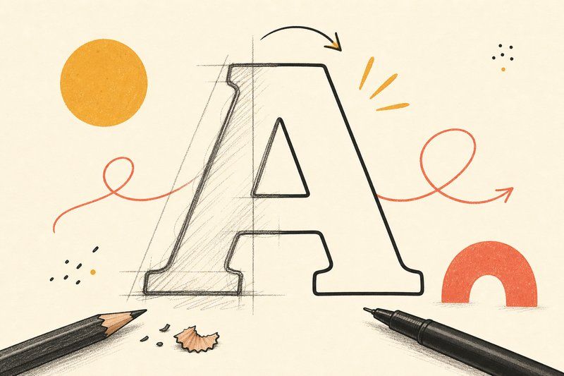
There’s a real, specific technical path between a letter drawn on paper and a font file you can actually install and type with. Here’s what happens at each step.
Step 1: get the drawing into digital form
If you started on paper, the first step is capturing your drawings digitally, usually by scanning or photographing each character clearly and consistently. Even lighting and a flat, uncreased page matter here more than people expect, since shadows or curled paper edges can distort a letter’s outline once the next step processes the image.
Step 2: vectorise the drawing
A scanned drawing is just a grid of pixels, a bitmap, with no inherent shape a computer can scale or edit as a letterform. Vectorising (sometimes called auto-tracing) converts that bitmap into a mathematical vector outline: a defined path a computer understands as a shape, which can then be scaled to any size without losing quality. Tools like Calligraphr do this automatically as part of converting your template into a font. Professional font editors like Glyphs or FontForge let you trace and adjust that outline by hand for finer control.
Step 3: clean up the outline
Scanning and auto-tracing frequently introduce small imperfections that weren’t part of your original intent: a slightly wobbly curve, an unwanted bump where pencil texture got picked up, or a gap where a line was too faint to scan cleanly. This is the point to smooth those outlines out, either through a tool’s automatic cleanup options or by adjusting individual points by hand in a font editor, deciding which imperfections are genuinely part of your style and which are just scan noise.
Step 4: set the spacing
Individually well-drawn letters can still look wrong together if the space around each one isn’t handled deliberately. Spacing (the gap on either side of a character) gets set after every letter exists, checking real letter combinations rather than judging each character in isolation. This is also the point where kerning, fine adjustments to specific letter pairs like “AV” or “To,” can be addressed, though it’s worth treating as a refinement for later rather than a requirement before your first export.
Step 5: export and actually test it
Once spacing feels right, exporting produces a standard .ttf or .otf font file, ready to install like any other font. Testing at this stage matters more than it seems: type full sentences, not just the alphabet in isolated order, since spacing and letter-combination problems often only reveal themselves in real words. Comparing your new font directly against established, professionally refined typefaces, for instance in our Type Tester, is a fast way to judge whether your weight and spacing choices are actually landing the way you intended.
Where to start if you haven’t yet
If you’re at the very beginning of this process, our how to design your own font guide covers the earlier steps, from deciding your proportions to choosing which tool (Calligraphr, FontStruct, Glyphs) actually fits your style, before any of the technical steps above come into play.
Frequently asked questions
What format does a digital font actually get saved as?
Most fonts today are distributed as .ttf (TrueType) or .otf (OpenType) files, both of which store each letter as a mathematical outline that can scale to any size without losing quality.
Do I need to draw my letters on paper first, or can I go straight to software?
You can go straight to software, especially with a grid-based tool like FontStruct, but drawing on paper first tends to produce more natural, consistent letterforms for handwriting-based or organic styles, since a mouse or trackpad rarely captures a hand's natural rhythm well.
How does a scanned drawing become a digital outline?
A process called vectorising (or auto-tracing) converts a scanned bitmap image into a mathematical vector outline, either automatically inside a tool like Calligraphr or manually in a font editor, redrawing the traced shape as clean, adjustable curves.
Why does my scanned font look messier than my original drawing?
Scanning and auto-tracing can introduce small bumps or wobbles that weren't visible on paper, especially from pencil texture or an uneven scan. Most font tools let you clean up these outlines afterward, either automatically or by adjusting individual points by hand.
What is spacing in font-making and why does it need separate attention?
Spacing is the gap on either side of each character, and it needs deliberate attention because even perfectly drawn letters can look cramped or gappy together if the space around them isn't set consistently. It's usually adjusted after every letter has been drawn, not before.
Can I make a font with only some letters, not the full alphabet?
Yes, a partial font (just capitals, for instance, or just a specific word or logotype) is a completely valid, finished project. It simply won't function as a general-purpose typeface for typing arbitrary text.
How do I test my font once it's exported?
Install the exported .ttf or .otf file and type real sentences in it, not just the alphabet in order, since letter combinations and spacing problems often only show up in actual words. Comparing it against established fonts, such as in our Type Tester, helps you judge whether the weight and spacing feel balanced.