
Hand-lettering for beginners: How to practice consistent letterforms
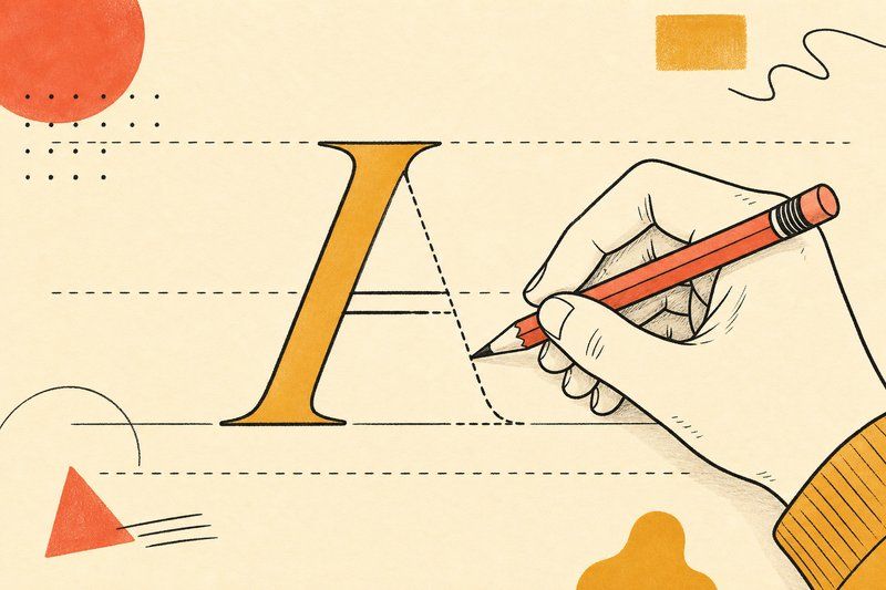
Hand-lettering looks like a talent some people simply have and others don’t, but the actual skill being tested is narrower than it looks: not raw artistic ability, but the ability to draw the same shape the same way, over and over, without it drifting.
Consistency beats skill, every time
A single, beautifully drawn letter tells you very little about whether someone can hand-letter well. What actually separates confident, professional-looking lettering from amateur attempts is whether every letter in a whole word shares the same height, weight and proportions. A slightly rough letterform repeated evenly across an entire alphabet reads as a deliberate style. A perfectly drawn letter that doesn’t match its neighbours reads as a mistake. This is genuinely good news for a beginner: consistency is a practice problem, not a talent problem.
Start with one letter, not the whole alphabet
Resist the urge to sketch your way through a whole word on day one. Pick a single lowercase letter, ideally something round like an “o” or “n,” since round letters expose height and weight problems fastest, and draw it repeatedly on ruled guides until it stops changing between attempts. Only once that one letter is stable should you move on to its closest relatives (c, e for an “o”-shaped hand; m, h, u for an “n”-shaped hand), checking each new letter directly against the one you already trust.
Use guide sheets, don’t freehand from a blank page
A blank sheet of paper gives your hand nothing to measure against, which is exactly why letters drift in height and angle the longer you draw. Ruled guide sheets, marking a baseline, an line, and often a slant angle, give you a fixed reference for every single letter, which is the single biggest factor separating consistent lettering from scattered attempts. Our own Practice Sheet Generator builds exactly this kind of guided paper, with adjustable baseline, grid or dot-grid styles you can print as many times as you need.
Move from letters to words
Once individual letters hold steady, the next real test is spacing between them. Words can look uneven even when every individual letter is well-drawn, simply because the gaps between letters vary too much. Practice whole words deliberately, not just isolated letters, and pay attention to the rhythm of the gaps as much as the shapes themselves.
What comes after consistent lettering
Hand-lettering and font design are related but distinct skills. Hand-lettering produces a one-off, custom piece of art, redrawn fresh every time you need it. A font is a reusable, systematic set of characters that work in any combination. Once your lettering is genuinely consistent, turning it into an actual working font file is a realistic next step, and our how to design your own font guide walks through exactly how that step from paper to font works, including the real tools people use to make it happen.
Frequently asked questions
How do I start hand-lettering as a complete beginner?
Start with one letter, not the whole alphabet. Pick a lowercase o or n and draw it repeatedly on ruled guides until its height, width and weight stop drifting between attempts, then move on to related letters.
Do I need expensive tools to practice hand-lettering?
No. A pencil, a pen, and printed guide sheets are enough to start. Specialised brush pens or calligraphy nibs matter more once you're refining a specific style, not while you're still building basic consistency.
Why do my hand-lettered words look uneven even when individual letters look fine?
This is almost always a spacing problem rather than a letterform problem. Even well-drawn letters can look chaotic together if the gaps between them vary too much; practising whole words, not just single letters, is what catches this.
What are guide sheets and why do they help?
Guide sheets are ruled paper marked with baseline, x-height and sometimes slant lines that keep every letter you draw at a consistent height and angle, which is the single biggest factor separating amateur-looking lettering from consistent, professional-feeling work.
How long does it take to get good at hand-lettering?
Consistency in a single style can develop within a few weeks of regular short practice sessions. Genuine range across multiple styles takes considerably longer, since each new style effectively means rebuilding that same consistency from scratch.
What's the difference between hand-lettering and calligraphy?
Calligraphy is written directly with a tool built for it (a broad nib or brush) in a single continuous motion. Hand-lettering is drawn and often redrawn, more like illustrating a letter than writing it, which gives you more room to adjust and refine each shape.
Should I trace letters when I'm learning, or always draw freehand?
Tracing is a legitimate way to build muscle memory for a letterform's proportions early on. The goal is to eventually draw the same shape freehand without needing the trace underneath, so treat it as a stepping stone, not a permanent method.
What should I practice after I can draw consistent letters?
Move on to full words, then short phrases, checking spacing and overall rhythm rather than individual letters. From there, turning consistent lettering into an actual reusable font file is the next real step.