
How art movements shaped typography: Bauhaus, Art Deco and beyond
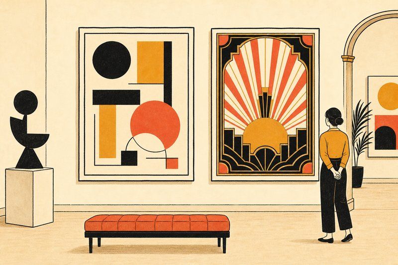
Type doesn’t evolve in a vacuum. Every major shift in how letters look traces back to a broader art or design movement that was changing how an entire era saw the world, and tracing that connection is one of the more genuinely surprising parts of type history.
Art history, hiding in plain sight in your font menu
Pick almost any distinctive typeface and you can trace its shape back to a specific art movement. A geometric sans-serif built from perfect circles and straight lines isn’t just “clean modern design,” it’s the Bauhaus, translated directly into letterforms. A typeface with stepped, sunburst-like ornamental details isn’t just “decorative,” it’s Art Deco, borrowing the same visual vocabulary that shaped the era’s skyscrapers and jewellery. For anyone curious about where these visual ideas actually come from, the art museum in modern times is worth a read on how museums themselves have wrestled with presenting movements like these to a modern audience.
The Bauhaus: function over ornament, applied to letters
Founded in Germany in 1919, the Bauhaus school built its entire philosophy around one idea: strip a design down to what it actually needs to do, and let the form follow from that function. Applied to type, that meant abandoning serifs, decorative flourishes, and centuries of ornamental habit in favour of clean geometric shapes. In 1925, Bauhaus workshop head Herbert Bayer designed an experimental alphabet built entirely from circles and straight lines as a direct expression of that philosophy. Two years later, working independently but along the same lines, Paul Renner released Futura, a geometric sans-serif that would go on to become one of the most influential typefaces of the 20th century.
Art Deco: glamour, speed, and geometric ornament
Where the Bauhaus rejected ornament, the movement that rose alongside it in the 1920s and 30s, Art Deco, celebrated a very different kind of geometry: bold, symmetrical, and unapologetically decorative. Art Deco typography favours dramatic contrast, stepped forms borrowed from skyscraper architecture, and sunburst motifs that echoed the era’s fascination with speed, machines, and luxury. It’s the look behind classic cinema title cards and vintage travel posters, and it still gets reached for today whenever a design wants to signal glamour with a wink of nostalgia.
A geometric sans built from perfect circles is the Bauhaus. Stepped, sunburst ornament is Art Deco.
Why the same decade produced two opposite styles
It can look like a contradiction that the 1920s produced both the austere, ornament-free Bauhaus aesthetic and the maximalist glamour of Art Deco at the same time, but the two were reacting to the same modern, machine-age moment from opposite directions. The Bauhaus saw the machine age as a reason to strip design down to pure function. Art Deco saw it as a reason to celebrate speed, luxury and geometric spectacle. Type from that single decade carries both instincts, sometimes in the very same typeface family.
What this means for how you look at type today
Once you know to look for it, you can date a huge amount of type just by its geometric personality: tight, perfect circles and straight lines point toward the Bauhaus lineage; stepped, symmetrical ornament points toward Art Deco; heavy contrast between thick and thin strokes points toward the serifs that came a century earlier. None of it is coincidence. It’s art history, quietly built into the shape of the letters you read every day.
If this connection between art and type interests you, our complete history of fonts traces the full timeline from Gutenberg through to today, and our guide to font types shows exactly what a geometric sans-serif looks like next to the serif styles that came before it.
Further reading: running a subscription box businessFrequently asked questions
How did art movements influence typography?
Art movements set the visual ideas of an era (geometric abstraction, ornament, rebellion against ornament) and type designers translated those ideas directly into letterforms, since type is one of the most visible, everyday pieces of design in any period.
What art movement created modern sans-serif type?
The Bauhaus, founded in Germany in 1919, is the movement most directly credited with popularising the modern geometric sans-serif, by applying its function-over-ornament philosophy straight to letterforms.
What is Art Deco typography?
Art Deco typography, associated with the 1920s and 30s, favours bold geometric shapes, dramatic contrast, and decorative flourishes like stepped or sunburst details, reflecting the movement's love of glamour, speed and machine-age optimism.
Did the Bauhaus design any real typefaces?
Bauhaus workshop head Herbert Bayer designed an experimental geometric alphabet in 1925, built entirely from circles and straight lines, though it was more a design statement than a widely produced commercial typeface.
How is Futura connected to the Bauhaus?
Futura wasn't designed at the Bauhaus itself, but Paul Renner, who released it in Germany in 1927, was working from the same geometric, function-first ideas the Bauhaus championed, which is why the two are so often mentioned together.
Why does type from the 1920s look so different from type today?
Type carries the visual fingerprint of its era's dominant art and design movements. The 1920s sit right at the pivot point between ornamental 19th-century display type and the stripped-down modernism that followed, which is why type from that decade often looks caught between two very different worlds.