
Practice Sheet Generator
Before a letterform becomes a font file, it has to become consistent on paper. Type a word, pick a guide style and a trace font, then print the sheet and draw over it until the shape holds steady without the guide. Nothing is uploaded. The sheet is built and printed straight from your browser.
How to actually use the sheet
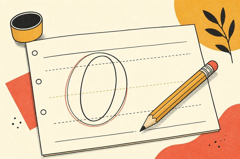
Print it, then trace the first row or two directly over the grey letterforms. That part is just calibration: you're teaching your hand how tall the letters are, how far apart they sit, and how much the strokes lean. Turn the fade option on and the rows get progressively lighter, so by the bottom of the page you're drawing the shape yourself with only the guide lines underneath. That gradual withdrawal of the crutch is the whole point of the sheet, and it's why the last row matters more than the first.
Pick the guide style to match what you're practising. The four-line baseline guide is the classic lettering ruling, with an ascender line, a dashed x-height line and a solid baseline, and it's the right choice for anything with a normal lowercase. The grid suits letters you're building from geometry rather than writing in one motion, and the dot grid gets out of the way when you want structure without lines showing through your drawing. Set the line height to something you can comfortably draw at, which for most people is larger than they first think.
Work on a few letters at a time rather than the whole alphabet. Type a short word containing the shapes you're struggling with, print several copies, and repeat it until the letters look like siblings instead of strangers. Consistency across repetitions is what you're chasing here, not any single beautiful character: a font is only as good as its most inconsistent letter, and the fastest way to see your own inconsistency is to have twenty copies of the same letter sitting in a column where you can compare them.
Why paper comes before software
Every stable typeface starts as a repeatable hand shape, not a Bézier curve. Practising a letterform on ruled guides until the proportions hold steady is the fastest way to know what you actually want before you open a font editor. Once the shapes feel consistent, our DIY type design guide covers digitising sketches into a working font file, and the type tester is where you compare the finished direction against real typefaces.
Frequently asked questions
How do I print the sheet?
Set your text, guide style and font, then click "Print this sheet". Your browser's print dialog opens with only the sheet itself, because the site header, footer and controls are hidden automatically. Choose "Save as PDF" there if you'd rather keep a digital copy.
What's the difference between the guide styles?
Baseline (4-line) is classic lettering paper: an ascender line, a dashed x-height line and a solid baseline, best for practising legible letterforms at a consistent height. Grid suits geometric or blackletter construction where verticals and angles matter more than a baseline. Dot grid is the lightest guide, useful once you're past basic shapes and practising spacing between letters.
What does "fade out row by row" do?
With it on, the first row is a solid, full-strength trace and each row after gets fainter, so by the last row you're drawing from memory rather than tracing. Turn it off to keep every row at the same faint guide strength instead.
Does this tool save my text or send it anywhere?
No. The sheet is generated and printed entirely in your browser. Nothing you type is uploaded, stored, or logged.
I've got consistent letterforms on paper. What's next?
Read the DIY type design guide for turning scanned or vector-traced sketches into a real font file, spacing and kerning included.