Fonts are vital for both design and content; they affect the audience’s various senses, making font psychology something a designer cannot afford to ignore. Focus on your brand’s message and emotions when choosing the correct font for your design.
A friendly font cannot be used to symbolize a bank. Remember, we’re humans seeking to connect with other humans, and dragging an impersonal, empathy-free branding strategy would eventually fail.
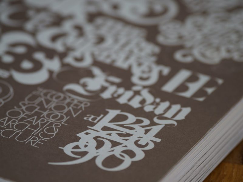
Another piece of advise is to put in some practice time. It may not be easy, but learning the fundamentals of typography will help you improve your design skills.
Consider your font choices carefully, and don’t be afraid to seek inspiration from others who have succeeded in your area.