
The complete font history: A timeline of type, from its origins to Google Fonts
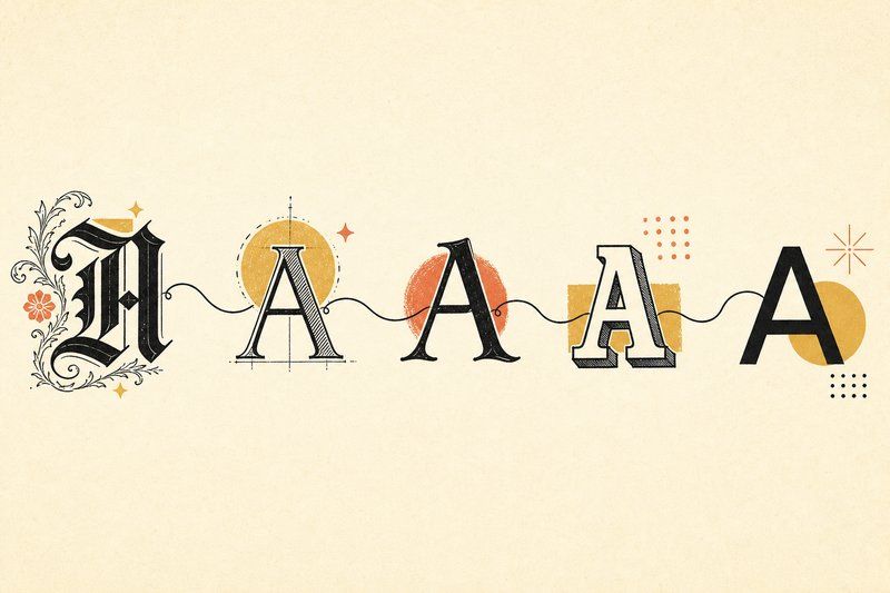
Font history is full of small, practical problems that got solved with a piece of metal, wood, or code, and every solution left a permanent mark on the shape of the letters we still read today. A serif is widely thought to trace back to a brush stroke's natural flare, reproduced in stone by Roman carvers. A monospace font exists because a 19th-century typewriter carriage had to move the same distance for every letter. This is that story, from the first printed book to the fonts loading on this page right now.
The font history timeline at a glance
The history of fonts is usually told as a straight line from Gutenberg to the web, and that timeline is a reasonable spine, but the origins of most letterforms are messier than the dates suggest. Shapes get invented, abandoned, and revived centuries later by someone who has only seen a printed specimen. What follows runs in order anyway, because the technology genuinely does move forward even when the letterforms circle back: scribes, then movable type, then industrial printing, then photosetting, then the screen.
Before printing: the origins of the written letterform
For most of written history, every copy of a book was made by hand. In medieval Europe, that work fell largely to monastic scribes, who developed increasingly dense, formal handwriting styles to fit as much text as possible onto expensive parchment. One of those styles, a tight, angular script known as blackletter, would go on to shape the very first printed typeface.
Gutenberg and the birth of the printed font (c. 1450–1455)
Johannes Gutenberg, working in Mainz, Germany, developed a practical system of movable metal type around 1450: individual letters cast in reusable blocks that could be arranged, inked, pressed, and then broken down and reused for the next page. His typeface, a blackletter style called Textura, was cut to imitate the formal manuscript hand of the period so closely that early printed Bibles were sometimes mistaken for handwritten ones. The Gutenberg Bible, completed around 1455, is the most famous product of that press and is widely treated as the starting point of Western printed type.
Blackletter spread across German-speaking Europe and stayed in common use there for centuries, while other regions moved toward rounder, more open letterforms drawn from Italian humanist handwriting instead.
The old-style serif era (1500s–1700s)
In 16th-century France, the Claude Garamond cut a set of roman letterforms so balanced and readable that the style still anchors most book design five centuries later, under his name: Garamond. Worth knowing if you go looking further: several of the most widely used "Garamond" digital revivals are actually based on later types cut by Jean Jannon in the early 17th century, which were long mistaken for Garamond's own work. Type from this period is what type historians now call "old-style," marked by a gentle diagonal stress and moderate contrast between thick and thin strokes. It was built for one purpose above all: comfortable reading across long passages.
Transitional and modern serifs (1700s–1800s)
As printing technology and ink improved through the 18th century, type could support sharper contrast without smudging. Transitional serifs, such as Baskerville, pushed contrast further and straightened the stress toward vertical. By the early 1800s, Italian printer Giambattista Bodoni had taken that trend to its extreme, producing Didone serifs with razor-thin hairlines against very heavy main strokes. Stanley Morison drew on this whole lineage when he directed the design of Times New Roman for The Times newspaper (drawn by Victor Lardent under his supervision), debuting in the paper in 1932 after Morison had publicly criticised its existing type as outdated.
Google Fonts launched in 2010 and quietly removed the cost of using real typography online.
The industrial 19th century: slab serifs and advertising type
The Industrial Revolution created a new demand: type that could shout from a poster across a crowded street, not just sit quietly in a book. Slab serifs, with their thick, square, high-visibility serifs, emerged directly from that demand and quickly became the default choice for advertising, playbills, and headlines. This same period also produced the first sans-serif typefaces used in commercial printing, though they were treated as a novelty rather than a serious choice for decades afterward.
The Bauhaus and the rise of modern sans-serif (1919–1930s)
Founded in Germany in 1919, the Bauhaus school preached a simple idea: strip design down to its essential function and let the form follow from that. Applied to letters, that philosophy meant discarding serifs and ornament in favour of clean geometric shapes built from circles and straight lines. In 1925, Bauhaus workshop head Herbert Bayer designed an experimental geometric alphabet along exactly those lines. Two years later, Paul Renner independently designed Futura, a geometric sans-serif that became one of the most influential typefaces of the 20th century and is still a default choice for clean, confident branding today.
Swiss Style and Helvetica (1950s)
By the 1950s, a movement known as Swiss Style (or International Typographic Style) pushed sans-serif type even further into the mainstream, favouring grid-based layouts and neutral, objective typography. Its most famous product arrived in 1957, when Max Miedinger and Eduard Hoffmann released Neue Haas Grotesk at the Haas Type Foundry in Switzerland. Renamed Helvetica for international distribution, it went on to become one of the most recognised and widely used typefaces on Earth, adopted for corporate logos from American Airlines to Lufthansa and for government signage across dozens of countries. (New York's subway signage is a common but inaccurate example: its 1966–70 Unimark standard actually specified Standard Medium, a different grotesque sans — the MTA didn't switch to real Helvetica until 1989.)
From metal to screen: phototype and the digital font
Through the mid-20th century, phototypesetting replaced physical metal type with projected light and film, and by the 1970s and 80s that process gave way to fully digital type. Two format decisions from this era still shape the fonts on your computer today: Adobe's PostScript font format in 1984, and Apple's TrueType format in 1991. Both let designers draw a letterform once as a mathematical outline that could be scaled to any size without redrawing it, which is exactly how every font on this page renders now.
Free type for everyone: the web font era
For the web's first decade and a half, most sites were limited to a handful of fonts already installed on a visitor's computer. That changed as browsers gained support for embedding real font files, and it accelerated sharply in 2010, when Google Fonts launched a free, open, constantly growing library of web fonts. Every typeface used across this site, including the one you're reading right now, is delivered the same way: a real font file, licensed openly, no different in principle from the metal Gutenberg once cast by hand.
Where this leaves today's type
Modern variable fonts, which can smoothly shift weight or width from a single file, are in some ways the logical endpoint of everything above: the same drive to make type more flexible, more legible, and easier to produce that pushed Gutenberg toward movable metal type in the first place. If you want to see how those centuries of change sort into practical categories you can actually use, our guide to font types picks up from here, and the Type Tester lets you compare an old-style serif against a Bauhaus-descended geometric sans in your own words, side by side.
One caution about any history of fonts told as a timeline, including this one: the neat dates belong to the technology, not to the letters. Ask when was the first font made and the honest answer depends entirely on what counts as a font, which is why the question comes up so often and gets answered so differently.
Frequently asked questions
When was the first font made?
It depends what you count. If a font means a set of cast metal sorts in one size and style, the first was Gutenberg's Textura type in Mainz around 1450. If it means a distinct typeface design, scribal hands predate printing by centuries. And if it means a digital font file, that belongs to the 1980s. The question has no single answer because the word font has changed meaning three times.
Who invented the first font?
Johannes Gutenberg is credited with the first widely used movable-type font in Europe, a blackletter design he cut around 1450 in Mainz, Germany, to print the Gutenberg Bible. Movable type itself was invented earlier in China and Korea, but Gutenberg’s metal-type system is what spread across Europe.
What was the first font ever created?
Gutenberg's Textura blackletter, used for the 1455 Gutenberg Bible, is generally considered the first true printing font: a complete, reusable set of metal letterforms designed to imitate the formal handwriting of the period.
What font did Gutenberg use?
Gutenberg's typeface was a blackletter style called Textura, closely modelled on the dense, angular handwriting used by scribes for religious manuscripts at the time.
When did sans-serif fonts become popular?
Sans-serif letterforms appeared in advertising as early as the 1810s, but they became genuinely mainstream in the 20th century, driven first by Bauhaus modernism in the 1920s and then by Swiss Style graphic design in the 1950s, which produced Helvetica.
What is the oldest typeface still in use?
Garamond, cut by the French punchcutter Claude Garamond in the 16th century, is one of the oldest typeface designs still in active, widespread use, including in modern digital revivals.
Why did the Bauhaus movement matter for type design?
The Bauhaus school, founded in Germany in 1919, argued that form should follow function and that ornament was often unnecessary. Applied to type, that meant stripping letters down to clean geometric shapes, which helped popularise the modern sans-serif.
What typeface did the Bauhaus create?
Herbert Bayer, head of the Bauhaus print and advertising workshop, designed an experimental geometric alphabet in 1925, sometimes called Universal or the Bauhaus typeface, built entirely from circles, straight lines and simple arcs.
When was Helvetica created?
Helvetica was designed in 1957 by Max Miedinger with Eduard Hoffmann at the Haas Type Foundry in Switzerland. It was originally called Neue Haas Grotesk before being renamed Helvetica for international release.
What is the history of Times New Roman?
Times New Roman was commissioned by The Times newspaper in London and designed under typographer Stanley Morison, debuting in the paper in 1932 after Morison had publicly criticised the paper’s previous typeface as old-fashioned.
When did digital fonts start?
Digital font technology developed through the 1970s and 80s alongside phototypesetting and early desktop computing, with Adobe’s PostScript format (1984) and Apple’s TrueType (1991) establishing the outline-font formats that modern computers still build on.
What came before printed fonts?
Before movable type, every book was a manuscript copied by hand, usually by monastic scribes, which made books slow and expensive to produce. The handwriting styles those scribes used, including blackletter, directly shaped the look of the first printed typefaces.
How did typewriters influence font design?
Typewriters required every character to occupy the same fixed width so the carriage could advance evenly, which is why monospace fonts like Courier exist and why that same fixed-width convention carried over into early computer displays and programming fonts.
When did Google Fonts launch?
Google Fonts launched in 2010, making a large, growing library of free, open-source web fonts available to any website, which significantly reduced the cost and technical barrier to using real typography online instead of a handful of system fonts.
What is the difference between a typeface and a font, historically?
Traditionally, a typeface was the overall design (Garamond, for instance) and a font was one specific size and weight of metal type cut for a printing press. Digital type collapsed that distinction for most everyday use, though type designers still draw the line carefully.