
Kingthings Fonts: free typography, explained.
Let’s make sense of type. Warm, plain-English guides to typography, type history and the craft of lettering, free to read, from people who actually draw the letters.

One word, five voices
same letters, different characterHamburgefonstiv is the nonsense word type designers set first when drawing a new face, because its letters hold most of the shapes an alphabet is built from.
- 01HamburgefonstivFrauncesSerif · old-style, soft
- 02HamburgefonstivBricolage GrotesqueSans · grotesque
- 03HamburgefonstivZilla SlabSlab serif
- 04HamburgefonstivCaveatScript · handwritten
- 05HamburgefonstivPirata OneBlackletter
Five ways into typography
pick your favouriteFresh off the press
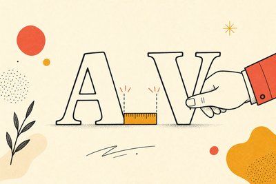
Free Kingthings fonts, and what this site is
Most people arrive here looking for the Kingthings typefaces themselves. They're still here, still free. The rest of the site is what grew up around them.
What are the Kingthings fonts?
Kingthings is the font foundry this domain was originally built for. It's the work of one designer, Kevin King, writing from Exeter, who drew them and gave them away. The 25 packages on this site run from gothic and medieval faces through decorative, cartoon and eroded display faces to a typewriter face and a few plain text faces. Between them they have been downloaded more than 8.2 million times, and every one is still free and still available here.
Are the Kingthings fonts free for commercial use?
Yes. The licence that ships inside each download says so in the designer's own words: "All the fonts currently published on my website (www.kingthingsfonts.co.uk) are free for you to use for any purpose you wish." The one thing he asks is that you don't modify his original font files, so we host every package exactly as he packaged it, unchanged.
Where do I download them?
From the fonts page, directly from this site. Each entry shows the real typeface rendered live, so you can see a face before you take it, and the download button hands you the designer's original .zip: the font files plus his own readme and licence, exactly as he released them.
What is the difference between a font and a typeface?
A typeface is the design, the set of shapes someone drew. A font is a particular instance of it you can actually set text in. Historically that meant one size of one weight in metal; today it usually means one file. In everyday speech the two words have collapsed into one, and almost nobody minds. Our font types guide goes further.
How many types of font are there?
There's no single official count, but most classification systems land on the same handful of families: serif, sans-serif, slab serif, script, blackletter and monospace, with sub-styles inside each. We break all six down, with live specimens you can actually look at rather than descriptions you have to imagine, in the types of font guide.
Can I try fonts out on this site?
Two free tools, no account, nothing uploaded. The type tester renders your own words live across nine real typefaces spanning every classification, so you can check a brand name or a headline against a genuine spread. The practice sheet generator prints ruled guides for drawing letterforms by hand.