
What is blackletter? The story behind Gutenberg's original typeface
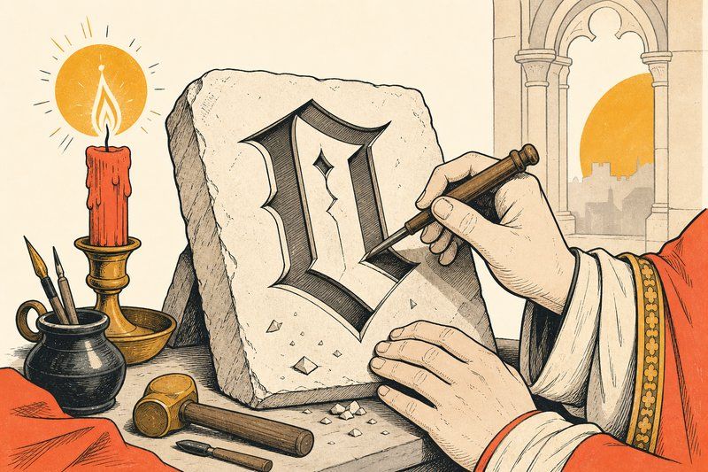
Blackletter is the oldest style of type still recognisable on sight today, dense, angular, and unmistakable, even to someone who’s never heard the word “blackletter” in their life. Here’s where it actually came from, and why it’s still around.
Where blackletter came from
Long before printing existed, medieval European scribes developed increasingly tight, angular handwriting styles to fit more text onto expensive parchment. That dense, vertical, heavily stroked script is what we now call blackletter, and it was the dominant handwriting style across much of Europe by the time Johannes Gutenberg began experimenting with movable metal type in the 1440s.
Gutenberg’s Textura
When Gutenberg needed a typeface for his printing press, he didn’t invent a new style from scratch. He cut a specific blackletter variant called Textura into metal type, closely imitating the formal manuscript hand used for religious texts at the time. The result, used for the Gutenberg Bible around 1455, was so faithful to handwriting that early readers reportedly mistook printed pages for manuscript ones.
Why “Old English” is a myth
Blackletter is commonly nicknamed “Old English,” but the name is misleading on two counts. It has nothing to do with the Old English language (the language of Beowulf, which looks nothing like blackletter on the page), and it wasn’t a specifically English style at all; it developed across continental Europe. The nickname stuck simply because blackletter looks archaic to modern eyes, and “old” plus “English” was an easy shorthand that outlived its own accuracy.
Fraktur: blackletter’s longest-lived descendant
While most of Europe moved away from blackletter in favour of rounder, more open serif letterforms by the 16th and 17th centuries, German-speaking Europe held onto a specific blackletter variant called Fraktur for centuries longer, using it for official documents, books and newspapers well into the 20th century. That long, separate life is part of why blackletter still carries a distinctly German association in a lot of people’s minds today.
Where blackletter survives now
Blackletter fell out of everyday use across most of the world by the mid-20th century, but it never fully disappeared. Plenty of long-running newspapers still carry a blackletter-style masthead, adopted back when the style felt current and kept ever since as a mark of heritage. Heavy metal and hardcore album art leaned into blackletter’s weight and aggression from the 1980s onward, turning it into a genre convention in its own right. A handful of streetwear and sports brands borrow the same association today, reaching for blackletter specifically because it reads as heavy, historic, and a little defiant.
Why blackletter isn’t used for body text
Blackletter’s dense strokes and tight spacing, exactly the qualities that made it feel weighty and important on a page, also make it genuinely harder to read at length than serif or sans-serif type. That’s why it survives almost entirely in short bursts today: a masthead, a logo, a single word on an album cover, never a paragraph.
If you want to see where blackletter sits alongside every other font family, our guide to font types covers it next to serif, sans-serif, script and monospace, and our complete history of fonts traces the full line from Gutenberg’s Textura through to the type on this page.
Frequently asked questions
What is blackletter type?
Blackletter is a dense, angular style of lettering, sometimes called Old English or Gothic script, developed from medieval European handwriting and used for the earliest printed books, including the Gutenberg Bible.
Did Gutenberg invent blackletter?
No. Blackletter existed as a handwriting style for centuries before printing. Gutenberg's contribution was cutting it into reusable metal type around 1450, which let it be printed rather than copied by hand.
Why is blackletter called 'Old English'?
The nickname is a popular misconception rather than a historical fact. Blackletter developed across continental Europe, not specifically in England, and it isn't connected to the Old English language. The name stuck anyway because the style looks archaic to modern eyes.
What's the difference between blackletter and Fraktur?
Fraktur is a specific, later style within the broader blackletter family, developed in German-speaking Europe and remaining in common use there for official documents and newspapers well into the 20th century, considerably longer than blackletter survived elsewhere.
Why do newspapers still use blackletter in their mastheads?
Many long-running newspapers adopted a blackletter-style masthead in the 19th century, when the style still felt current, and kept it afterward as a mark of heritage and continuity rather than a live typographic choice.
Why is blackletter used on metal band logos?
Blackletter's dense, sharp, aggressive letterforms carry a sense of weight and history that fits the genre's visual identity, and the association became a genre convention in its own right from the 1980s onward.
Is blackletter hard to read?
It's noticeably slower to read than serif or sans-serif type, especially in long passages, which is exactly why it's almost never used for body text today. Its density works well for a short word or a logo, not a paragraph.