
The most hated font in the world? The story of Comic Sans
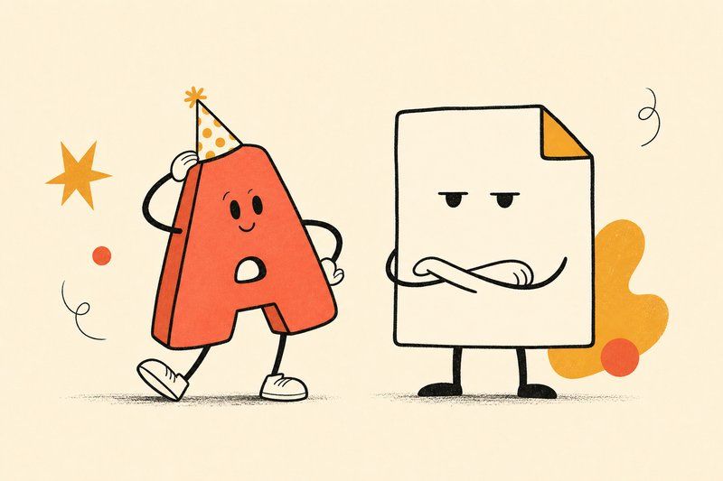
No font has been mocked as consistently, or as publicly, as Comic Sans. The strange part is that the font itself was never the joke. Here’s what actually happened.
A font designed for a cartoon assistant
Vincent Connare, a type designer at Microsoft, created Comic Sans in 1994 while working on Microsoft Bob, a friendly software interface built around cartoon characters aimed at helping new computer users feel less intimidated. Connare noticed a specific problem: the program’s dialogue boxes used a serious, formal font that clashed awkwardly with Bob’s playful cartoon dog and other characters. He designed Comic Sans specifically to fix that mismatch, loosely basing its rounded, informal letterforms on the hand-lettering style he’d been studying in comic books, particularly Watchmen and The Dark Knight Returns.
How it escaped its original job
Comic Sans didn’t actually ship in time for the original Microsoft Bob release it was designed for, but it shipped as a system font on Windows shortly afterward, which meant it was suddenly available to absolutely everyone, for absolutely anything. And that’s exactly what happened. Comic Sans became a default, easy reach for anyone who wanted their document, sign, or flyer to feel a little friendlier, with no real filter for whether the context called for friendly in the first place.
From default choice to running joke
Through the late 1990s and 2000s, Comic Sans started turning up in contexts wildly mismatched to its playful tone: hospital signage, legal notices, memorial plaques, corporate memos. The backlash grew in direct proportion to the mismatch. Design communities began treating Comic Sans as shorthand for a complete absence of typographic judgement, and the joke stuck hard enough that it’s arguably more famous today for being mocked than for its original, genuinely reasonable purpose.
It never even shipped in time for the software it was designed for.
What the whole saga actually teaches
Comic Sans is a perfectly competent casual sans-serif font. The backlash was never really about its letterforms; it was about people reaching for it in contexts it was never built for, then blaming the font for the mismatch. It’s a useful cautionary example for anyone choosing a typeface: the right font in the wrong context reads just as badly as the wrong font.
If you’re curious where Comic Sans actually sits among the wider sans-serif family, our guide to font types covers the humanist, geometric and grotesque sans-serif branches it’s loosely adjacent to, and our complete history of fonts traces the century of type history it arrived at the tail end of.
Frequently asked questions
Who designed Comic Sans?
Vincent Connare, a type designer working at Microsoft, designed Comic Sans in 1994.
Why was Comic Sans created?
Connare designed it for a casual, cartoon-style dialogue box in Microsoft Bob, a friendly software assistant aimed at new computer users, after noticing the program's default serious font clashed badly with its playful cartoon characters.
Is Comic Sans a bad font?
Not on its own merits. Comic Sans is a competently drawn casual sans-serif font. Its reputation comes almost entirely from being used in contexts, official documents, medical signage, legal notices, that a playful, informal font was never designed for.
Why do people hate Comic Sans so much?
The backlash grew through the late 1990s and 2000s as Comic Sans became the default choice for anyone wanting a friendly font, regardless of context, and its overuse in mismatched serious settings turned it into a running design joke.
Is Comic Sans a sans-serif font?
Yes, technically. Comic Sans has no serifs and belongs to the casual, handwriting-inspired branch of the sans-serif family, even though its cartoonish reputation makes that classification easy to forget.
What font did Comic Sans base its style on?
Vincent Connare based its loose, rounded letterforms on comic-book lettering, particularly the hand-lettering style he had been studying in Watchmen and The Dark Knight Returns while working on a different project shortly before designing it.
Are there fonts designed as a direct response to Comic Sans?
Yes. A few designers have released deliberately more refined casual fonts explicitly marketed as more usable, professional alternatives to Comic Sans, treating its cultural reputation as a genuine design brief to improve on.
Is Comic Sans actually useful for anything?
It's a genuinely reasonable choice for exactly the kind of playful, informal, low-stakes context it was designed for, a children's activity, a casual event flyer, a comic-style dialogue box, provided it's kept away from anything meant to read as serious or authoritative.