
Six font pairings that work for almost any brand
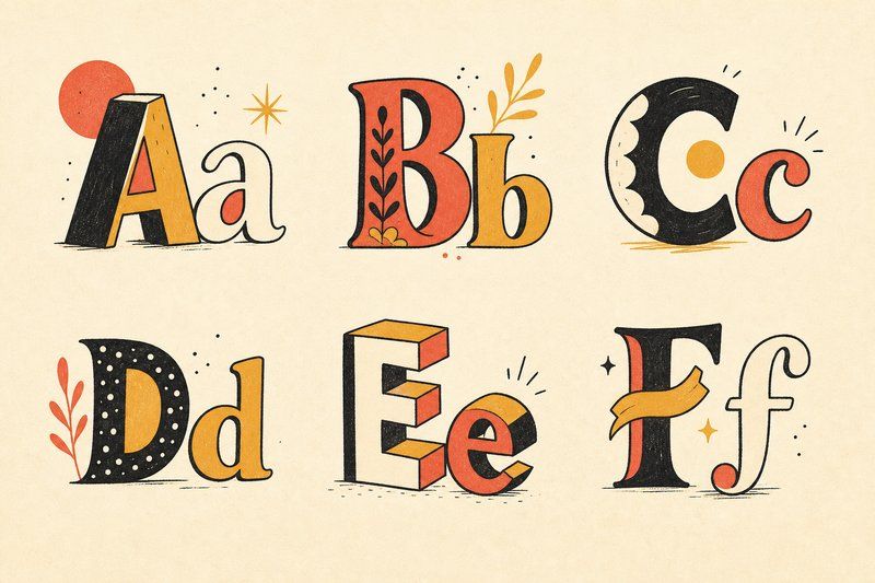
If you’d rather start from proven combinations than build a pairing from scratch, these six cover a wide range of tone while staying genuinely reliable.
1. Old-style serif heading + humanist sans body
A warm, literary serif heading (think Garamond or Fraunces) over a clean humanist sans body (Lato, Nunito Sans) reads as established but approachable. It’s a strong default for editorial content, professional services, and any brand that wants to feel trustworthy without feeling cold.
2. Didone serif heading + grotesque sans body
A high-contrast, dramatic serif like Playfair Display, paired with a plain, neutral sans like Work Sans, creates immediate, elegant contrast. This pairing shows up constantly in fashion, beauty and editorial branding, where the heading needs to carry real visual drama.
3. Geometric sans heading + geometric sans body (different weights)
Using a single geometric family like Futura or a similar modern equivalent, in a bold weight for headings and a regular weight for body text, produces a clean, consistent, unmistakably modern system with zero risk of two fonts clashing.
4. Slab serif heading + humanist sans body
A sturdy slab serif heading (Rockwell, Clarendon) over a warm humanist sans body gives a design confidence and approachability at the same time. It’s a common choice for craft, food and heritage brands that want to feel authentic without tipping into old-fashioned.
5. Blackletter accent + clean sans body
Used sparingly, a blackletter word or initial alongside a plain, modern sans body creates a striking contrast between historic weight and contemporary clarity. This pairing works best in small doses, a logotype or a single header, rather than across an entire page.
6. Monospace accent + humanist sans body
A monospace font used for small labels, tags or technical details, alongside a humanist sans for everything else, signals precision and a technical edge without making the whole page feel like a code editor. It’s an increasingly common choice in tech and product design specifically because the contrast between the two rhythms (even monospace spacing against natural proportional spacing) reads as intentional.
Testing any of these before you commit
Every pairing above is a strong starting point, not a guarantee, since the actual words you set in it matter as much as the fonts themselves. Try your own headline and body copy in the Type Tester before finalising anything, and if you want the underlying principles behind why these six work, our guide to pairing fonts covers contrast versus harmony pairing in more depth.
Frequently asked questions
What is a safe font pairing for a small business?
A classic serif-and-sans pairing, such as a transitional serif heading with a humanist sans body, is a safe, tested default that reads professionally in almost any industry.
Can I use these pairings for a website, not just print?
Yes. All six pairings below work equally well on screen, provided both fonts are available as real web font files with the weights you need, most of which are freely available.
Do I need to pay for these font pairings?
No. Every pairing below can be built entirely from free, open-source fonts, most available through Google Fonts or similar libraries.
How do I know if a pairing is too similar?
If you have to look twice to tell which font is which, the pairing doesn't have enough contrast. Two grotesque sans-serifs of similar weight, for instance, tend to blur together rather than read as a deliberate choice.
Should my heading font and body font be from the same type foundry?
It's not required. Plenty of strong pairings mix fonts from entirely different sources; what matters is that the two fonts' proportions and moods sit well together, not their origin.
Which of these pairings works best for a tech startup?
The geometric sans system (pairing 3) or the monospace accent pairing (pairing 6) both read as modern and precise, which is why they show up so often in tech branding specifically.
What pairing works best for a restaurant or food brand?
The slab serif and humanist sans pairing (pairing 4) is a common, reliable choice, since it balances sturdiness and warmth without feeling either too corporate or too delicate.
Can I swap the fonts named in these pairings for similar alternatives?
Yes. Each pairing describes a relationship between two font styles, not a strict requirement to use the exact named fonts. A different old-style serif or a different humanist sans will generally slot into the same pairing logic just as well.