
Best fonts for print vs. digital: What actually changes
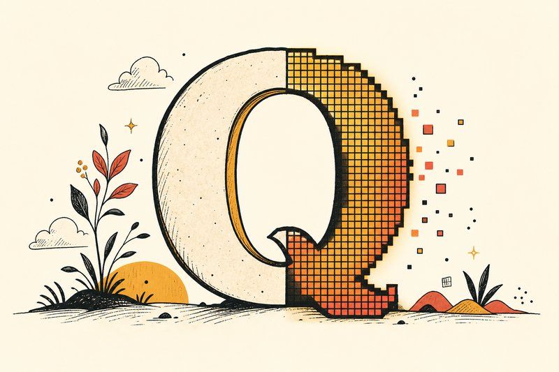
A genuinely good typeface can usually work in both print and digital contexts, but “usually work” isn’t the same as “work identically without any adjustment.” Here’s what actually changes between the two.
The old serif-versus-sans rule doesn’t hold up anymore
For years, the standard advice was serif for print, sans-serif for screens, based on a real technical limitation: early low-resolution monitors blurred fine serif detail into mush. That constraint largely disappeared once high-resolution displays became the norm. A well-made serif font renders perfectly cleanly on a modern phone or laptop screen today, which means the actual choice between serif and sans-serif should come down to tone and genuine readability testing, not an automatic rule inherited from decades-old hardware.
Ink versus pixels changes how a font actually looks
Print and screen render the same font file through completely different physical processes: ink absorbing into paper versus individually lit pixels. That difference can make identical fonts look subtly heavier or sharper depending on the medium, particularly at fine detail sizes. It’s worth proofing a font choice in its actual final medium rather than assuming a screen preview tells you exactly how it will look on a printed page, or the reverse.
Proof it in the medium it will actually be read in.
Size and spacing need separate checks
A font size that reads comfortably on a printed page, held at a typical reading distance, doesn’t automatically translate to the same comfort on a screen viewed from a different distance and resolution. Always check size and line spacing directly in the medium you’re actually shipping to, rather than assuming a setting that worked in one carries over cleanly to the other.
What’s genuinely print-only
A few font considerations are print-specific and simply don’t apply to digital work at all. Ink spread, where fine printed details can blur slightly as ink absorbs into the paper’s fibres, can make very thin serifs or delicate script strokes look less crisp than the same font renders on screen. Colour reproduction across different printing processes and paper stocks is its own separate concern with no direct digital equivalent either.
What’s genuinely digital-only
On the other side, loading performance and file weight are entirely digital concerns: a printed brochure never needs to “load” before a reader can see it, but a website absolutely does, and an unnecessarily large font selection can measurably slow a page down. Cross-device rendering consistency (making sure a font actually looks right across different browsers, operating systems and screen densities) is likewise a purely digital problem with no print parallel.
The practical takeaway
A strong font choice can absolutely serve both a printed piece and a website, provided you check it properly in each medium rather than assuming settings transfer automatically. Our guide to pairing fonts and font for a website checklist cover the practical side of getting a font right in each context, and our Type Tester is a fast way to preview a candidate on screen before you commit to a print run you can’t easily undo.
Frequently asked questions
Do I need different fonts for print and digital projects?
Not necessarily different fonts, but different considerations. A well-made font can work in both contexts; what changes is how you size it, space it, and which weight you choose for each medium.
Is the serif-for-print, sans-for-screen rule still true?
It's outdated as a strict rule. It comes from an era of low-resolution screens that blurred fine serif detail. Modern high-resolution displays render serif fonts cleanly, so the choice comes down to tone and readability testing rather than an automatic rule.
Why do fonts sometimes look different in print than on screen?
Print and screen render fonts through completely different processes, ink on paper versus lit pixels, which can make identical font files look subtly different in weight and sharpness between the two.
Does font size need to change between print and digital?
Yes, generally. Screen viewing distance and resolution differ enough from typical print reading that a size which feels right on paper can feel too small or too large on a screen, so size should be checked separately in each medium rather than assumed to transfer directly.
What print-specific font issues don't apply to digital?
Ink spread (where fine details can blur slightly as ink absorbs into paper) and colour reproduction across different printing processes are print-specific concerns that simply don't exist for digital display.
What digital-specific font issues don't apply to print?
Loading performance, font file weight, and cross-device rendering consistency are all digital-only concerns. A printed page never needs to 'load' before a reader sees it.
Can the same font work for both a printed brochure and a website?
Yes, provided the font is available as both a print-ready format and a proper web font file, and provided you check sizing and weight separately for each medium rather than assuming settings transfer directly.