
What is a geometric sans-serif? Futura, Century Gothic and the shapes behind them
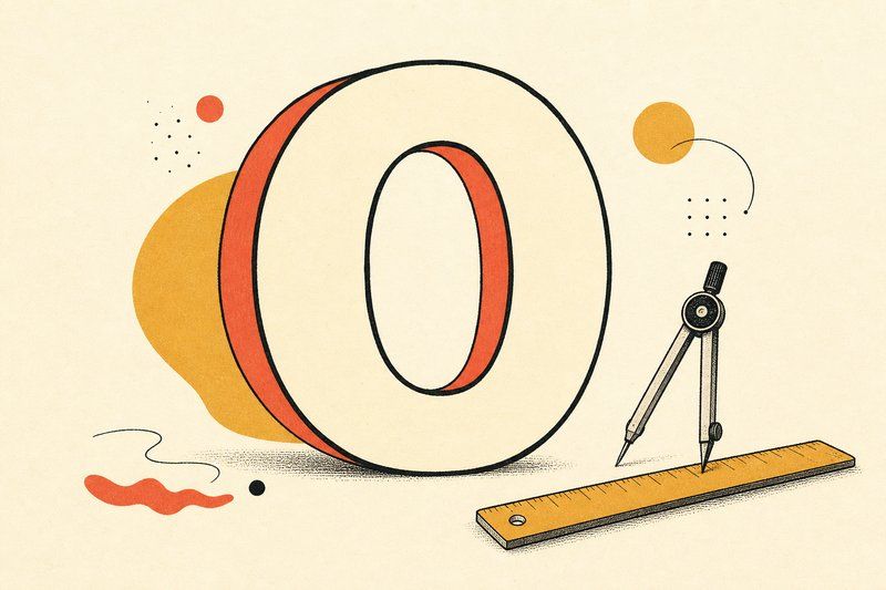
Geometric sans-serifs are the most literally “drawn with a compass and ruler” typefaces in everyday use, and once you know to look for perfect circles and straight lines, you’ll spot the style everywhere.
Built from shapes, not handwriting
Where a humanist sans-serif borrows its proportions from handwriting, a geometric sans-serif is built from simple, near-mathematical shapes instead: circles, straight lines, simple arcs. Look at the lowercase “o” in a geometric font and it’s often close to a perfect circle. That same discipline carries through every letter, producing a very even, consistent stroke width across the whole alphabet.
Futura: the style’s defining example
Paul Renner released Futura in Germany in 1927, building it directly on the geometric, function- first design ideas circulating through German modernism at the time, closely related to what the Bauhaus was doing with typography in the same decade. Futura became one of the most commercially successful and enduringly influential typefaces of the 20th century, and it remains a default choice today whenever a design wants to read as clean, confident and unmistakably modern.
Century Gothic: the same idea, wider and more open
Century Gothic takes the geometric approach even further, with notably wide, open and letterforms that lean even closer to pure circles than Futura’s. That extra openness gives it a slightly friendlier, more approachable read while keeping the same essential geometric discipline.
Why the style still reads as modern
Geometric sans-serifs carry a specific historical association: early 20th-century modernism, particularly the Bauhaus’s belief that ornament should justify its own existence and that form should follow directly from function. That association has held for roughly a century, which is genuinely unusual for a design trend, and it’s exactly why the style still reads as clean and contemporary rather than dated.
When to reach for one
Geometric sans-serifs excel at headlines, logos and branding that want to feel precise and confident. They’re a slightly riskier choice for long body text, where their very even stroke width and tight geometric counters can read as marginally less comfortable than a humanist sans built explicitly with reading comfort in mind. Our guide to font types covers all three sans-serif sub-styles, geometric, humanist and grotesque, side by side if you want to compare them directly, and our complete history of fonts traces exactly how the Bauhaus’s ideas fed into Futura’s design in the first place.
Frequently asked questions
What makes a font a geometric sans-serif?
Geometric sans-serifs are built from simple, near-perfect geometric shapes, circles, straight lines and simple arcs, giving letters like o and a nearly circular counters and a very consistent, mechanical stroke width.
Is Futura a geometric sans-serif?
Yes, Futura is one of the defining examples of the style, released by Paul Renner in Germany in 1927, built directly from circular and straight-line geometry.
What's the difference between geometric and humanist sans-serif?
A geometric sans-serif is built from strict, simple shapes with very even stroke width. A humanist sans-serif borrows proportions and stroke variation from handwriting and classical serif letterforms, giving it a warmer, less mechanical feel.
Is Century Gothic a geometric font?
Yes, Century Gothic is a well-known geometric sans-serif with notably wide, open, nearly circular letterforms, closely related in spirit to Futura.
Why do geometric sans-serifs feel modern?
The style is directly tied to early 20th-century modernist movements, particularly the Bauhaus, which prized function and stripped-down geometric form. That association has stuck for a century, which is why the style still reads as clean and contemporary.
What brands use geometric sans-serif logos?
Geometric sans-serifs are a common choice across tech, fashion and minimalist consumer branding specifically because of their clean, confident, precisely constructed appearance.
Are geometric sans-serifs good for body text?
They can work, but their very even stroke width and tight geometric counters can feel slightly less comfortable across long passages than a humanist sans, which is built with reading comfort more explicitly in mind.